One of the more puzzling questions surrounding the COVID-19 crisis has been the huge difference in outcomes. Fatality rates differ significantly across countries—and across regions within countries. Some of this is related to which part of the population was exposed to the virus, as older people and people with pre-existing medical conditions are significantly more susceptible. Wherever the virus has taken hold in seniors' homes, the outcome has been devastating.
‘The U.S. COVID-19 fatality rate is twice as high as in Germany and three times as high as in Canada.’
It is still early to deliver meaningful empirical analysis as the crisis is still progressing. Nevertheless, there are some interesting patterns emerging from the available data—and new questions for policy makers and researchers alike. I have spent some time analyzing sub-national data from the United States and Germany to get a better understanding of what could explain why countries such as Canada and Germany have seen lower fatality rates than the United States and Great Britain. As I am writing these lines (April 17), Spain's fatality rate topped 400 people per million, Great Britain exceeded 200, and the United States 100. By comparison, Germany's rate stood at 47 and Canada's at 32. South Korea's was a tiny 4.5 by comparison. The orders of magnitudes between these outcomes are enormous. Fatality rates in Spain are twice those in Britain, Britain's are twice those in the U.S., the U.S.'s rate is twice that of Germany's.
Even within countries, the rates are hugely different. The outcomes in the United States range from less than 5 people per million in Wyoming to over 500 people per million in New York. What explains these huge differences? I have investigated the data made available by the COVID Tracking Project for the 50 U.S. states plus the District of Columbia. I have tested four different hypotheses that are readily testable given the available data. One of the key policies to combat the SARS-CoV-2 virus is testing and tracing—finding who is infected and tracking down anyone that person has come into contact with.
The first hypothesis relates to when the outbreak started in different states. The diagram below plots the gap in onset, where onset is defined when a state reached a threshold of 1 COVID case per 100,000 people. The first state to reach the threshold was Washington state, and the last one West Virginia. The gap is about 20 days, just under three weeks. The green regression line shows a weak positive correlation. The states that experienced COVID-19 earlier have worse outcomes. The states that got an extra two or three weeks fare better.
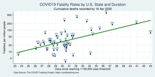
click on image for high-resolution PDF version
Another crucial relationship concerns population density. Importantly, I use population-weighted population density which better captures the degree of urbanization of individual states. Population density matters because the virus is easier to spread when people live closer together. More urban states are therefore more disadvantaged. New York's population density is the highest (except for DC if taken as a state equivalent). More populous, denser states also tend to be hit earlier by the virus, and there is some correlation between the onset delay (the number of extra days some states had after Washington's outbreak) and population density.
The table below shows the results of three simple ordinary least squares regression models where the log of the COVID-19 fatality rate is the dependent variable. Model (A) starts with the onset delay and the log of population density as independent variables. Both variables show up significantly. The longer the onset delay, the lower the fatality rate, and the denser a state, the higher the fatality rate.
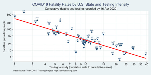
The next hypothesis concerns the amount of testing. First, does it matter how much testing happens in each state on a per-capita basis? For this model (B) introduces the log of tests per capita, and this variable actually shows up significantly. At first this would suggest that more testing is actually not beneficial for outcomes, but this conclusion is faulty. The amount of testing in a state is likely endogenous: the more cases, the more testing; not the other way around. Model (B) is therefore likely misspecified because of the endogeneity of the independent variable. However, there is a better way of measuring testing, because testing is targeted. The more useful measure is how many tests are performed relative to each identified case. When cases are traced, it is is important to test all the people that someone has come into contact with. The more of these people are tested, the more likely one can find other infected people. Therefore, model (C) replaces the per-capita testing intensity variable with the tests-to-cases ratio, which provides a superior way of measuring testing intensity. Technically, this variable is the logarithm of the number of cumulative tests to cumulative cases (where the tests turned out positive). The result in model (C) is stunning. The variable is highly significant. It also displaces some of the effect of onset delay and, more so, population density. The raw correlation between testing intensity (tests per cases ratio) and the fatality rate is shown in the next diagram. Roughly 78% of the variation in the data can be captured with model (C).
The diagram below shows the strong relationship between testing intensity and fatality rate. But is this coincidental or causal? Unlike the simple per-capita testing intensity, the tests-per-case ratio is specific to tracing effort. It can be considered a metric of tracking intensity. From the diagram it is clear that testing and tracing is woefully inadequate in some of the states with the highest fatality numbers. There should have been more much testing in New York and New Jersey, but these states were caught early and were not fast enough ramping up testing and implementing tracing protocols. Who was responsible for this slow and undersized response—federal or state agencies—will no doubt become a political theme in the months to come.
click on image for high-resolution PDF version
What can we all learn from the U.S. experience? Clearly, testing and tracing plays an out-sized role in containing the SARS-CoV-2 pandemic. Empirical analysis in the months to come will probably shed more light on specific policy measures, as well as the slow response of the U.S. administration (He Could Have Seen What Was Coming: Behind Trump's Failure on the Virus). Crucial time was lost. By the time the virus hit Italy hard, it should have been abundantly clear to everyone that radical containment measures were necessary. The first stay-at-home order went into effect in California on March 19, followed on March 21 and 22 by Illinois, New Jersey, and New York. Other states, notably Texas and Florida, waited until April 2 and 3 to follow suit. If the above analysis is predictive, this two-week delay may ultimately come to be regretted, especially in Florida where the fatality rate is already twice as high as in Texas. The false sense of "we seem to have been spared for now" wasted precious time for preparation. Taking the estimated coefficient of about -0.07 times 14 days, onset delayed by that long reduces fatalities by 38%. How many lives could have been saved if policy makers at the state level had not dragged their feet, for whatever partisan political reason?
Ultimately, the COVID-19 response in the United States falls short of what could have been done if the administration had taken a decisive and clear approach and trusted medical experts. Instead, as late as March 24, U.S. president Trump continued to compare the coronavirus to the flu, suggested easing social distancing by Easter, and engaged in medical quackery by promoting an anti-malaria drug for treatment. How many innocent lives were lost because of the lack of clear, concise, timely, and coordinated messaging? How many were lost because of delayed and insufficiently-scaled testing? (The Lost Month: How a Failure to Test Blinded the U.S. to Covid-19 )
The COVID-19 crisis also highlights the many shortcomings of the health care system in the United States, which even though the U.S. has the highest health spending per capita, it has some of the worst performance among OECD countries (OECD, 2017). Life expectancy in the United States is well below the OECD average. Compared to other OECD nations, the U.S. has some of the highest rates of hospitalizations for preventable causes and the highest rate of avoidable deaths (Commonwealth Fund, 2020). The U.S. health care system is excellent for those who can afford it, but fails those who are uninsured or under-insured.
‘Early empirical analysis strongly supports the case for expanded COVID-19 testing and tracing.’
Compare the United States with Canada, whose COVID-19 fatality rate is less than a third of that of the United States at this point. Canada's response was more decisive, and testing was more widespread on average. In Canada, as of April 17 there were 503,003 tests with 31,407 positive cases—a ratio of 16. It puts Canada roughly on the red line in the above diagram somewhere between Vermont and Maine. If we want to reopen our economies North and South of the 49th parallel, testing and tracing will need to be expanded wherever there is a deficit. My early empirical analysis above strongly supports the case for expanded COVID-19 testing and tracing.
Naturally, there are important caveats to the empirical analysis above. The data is from a still early stage, and fatality rates are going to evolve as the disease progresses throughout 2020. The data set is quite small (just 51 observations) and merely a cross section without longitudinal information. Endogeneity, as mentioned above, is another problem that must be handled carefully to avoid faulty conclusions. There is almost certainly spatial auto-correlation in the data because of the way the virus spreads, and this is not taken into account above. Better regional disaggregation (county-level data) will shed additional light on policy outcomes when comparing different approaches. One issue that has not been addressed at all above is the role of demographics. States are only now starting to release (incomplete) data about the demographic composition of infected people and deaths. Empiricists will be busy in the next months sorting through the growing amount of evidence. The hope is that COVID-19 will prepare us better for the next time we're struck by a novel type of virus—as much as we can hope that there won't be a next time, chances are that COVID-19 will not be the only pandemic of the 21st century.
Among the issues not addressed above is the demographics of fatalities. It is well understood that older people are more vulnerable to COVID-19 than younger ones, and therefore the age composition of the infected matters, and in turn influences the overall fatality rate. A brand-new research paper uses data from Italy and South Korea to show that shows a "dramatically higher burden of mortality in countries with older versus younger populations." The conclusion is powerful: "social distancing and other policies to slow transmission should consider the age composition of local and national contexts." In order to mitigate the severity of COVID-19 in the United States, more effort is needed to protect elderly and vulnerable population groups.
Further readings and information sources:
- Jennifer Beam Dowd et al.: Demographic science aids in understanding the spread and fatality rates of COVID-19, PNAS April 16, 2020