Updates of all my COVID-19 charts (international and Canadian) are made available at 9am Pacific Time every morning on the COVID-19 Country & Canadian Province Comparisons web page.
Amidst the COVID-19 pandemic, one chart has become the de-facto standard for showing the progress of the disease in each country. A version of it is shown below. The horizontal axis shows days (or weeks) elapsed since registering 100 cases (or 25 deaths), and the vertical axis shows the number of reported cases (or deaths) on a logarithmic scale. These charts implicitly show the "flattening of the curve" if growth rates start to drop, as the growth rate is the slope of the curve. However, these charts also compare different countries, and this is where the comparisons go wonky. Comparing the position of countries on the charts if flawed if no adjustment is made for population size, and of course no scientific conclusions can be drawn from simple comparisons in a chart without further rigorous analysis.
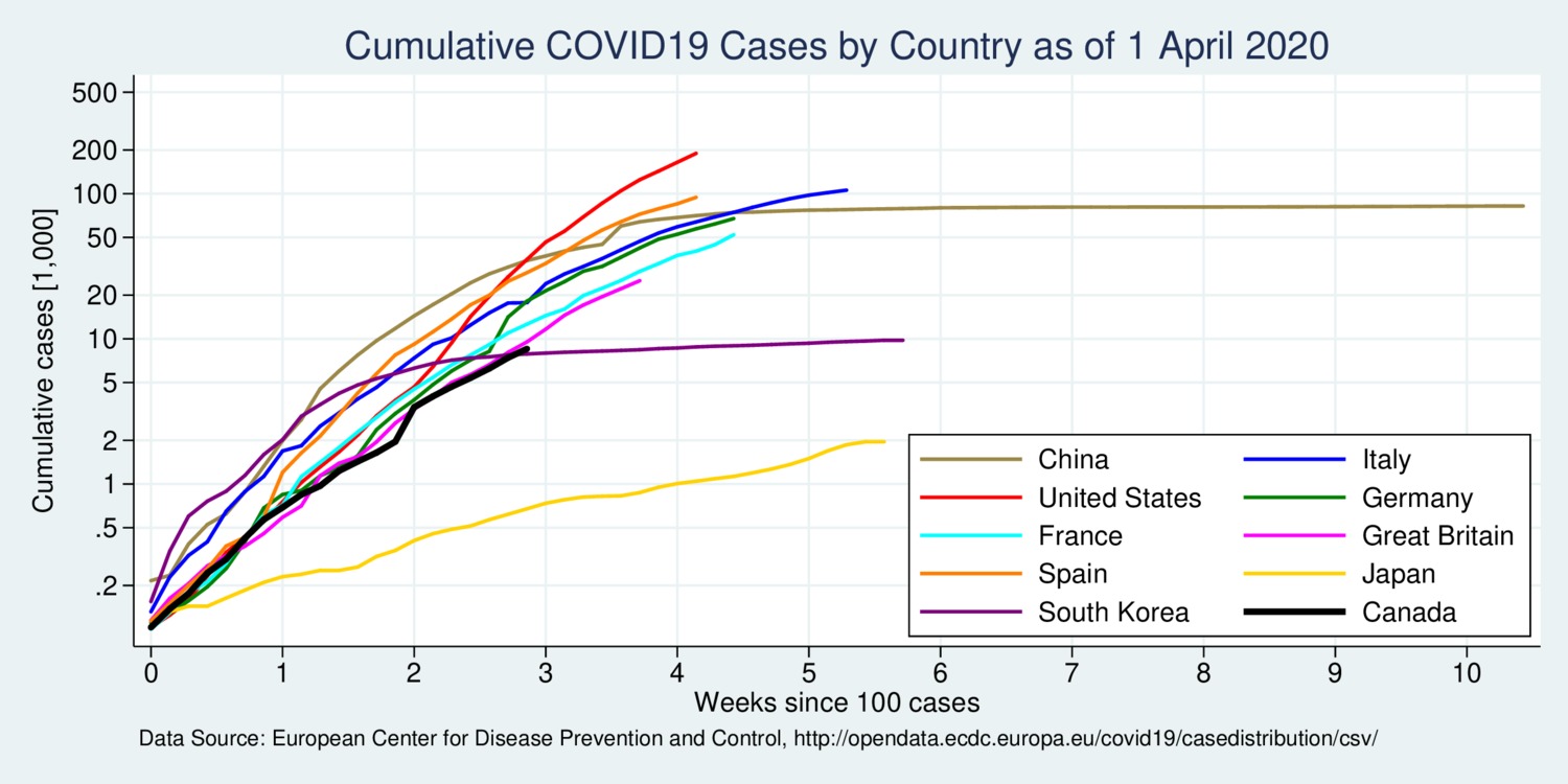
click on image for high-resolution PDF version
If one wants to make any international comparisons with this type of chart, it is necessary to adjust for population size on the horizontal and vertical axes. The horizontal axis thus needs a new starting point: the day when the number of cases crosses the 1 per 100,000 people threshold. The vertical axis displays the cumulative number of cases per 100,000 people. The next chart shows this type of adjustment.
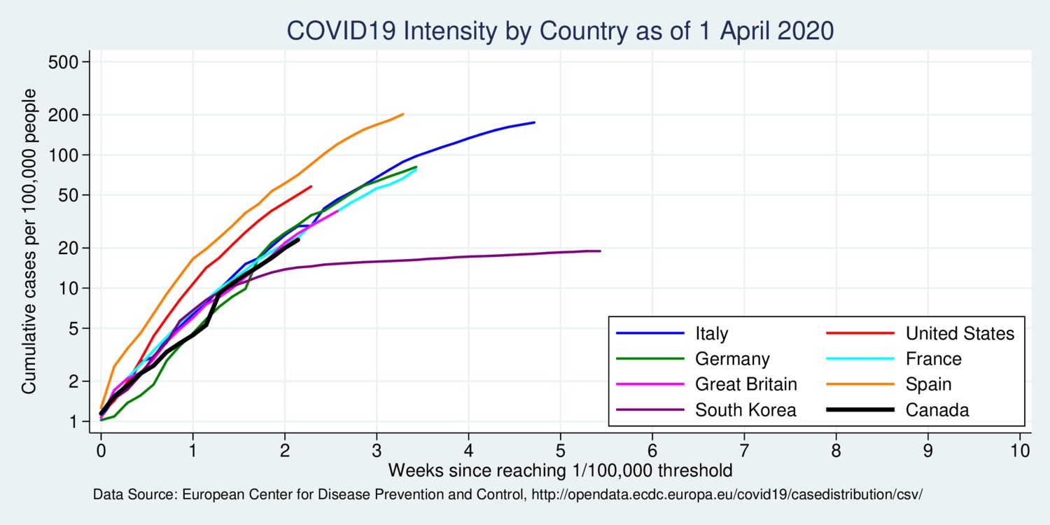
click on image for high-resolution PDF version
What can be learned from the population-size adjusted diagram that cannot be learned from the unadjusted diagram? First, it better aligns the time when the outbreak became significant, because one hundred cases in one location is still not the same as 100 cases in another location. A definitive threshold of 1 per 100,000 cases does not depend on country size. As of April 1 when this blog was written, South Korea is ahead of other countries (except China) in week 5, followed by Italy in week 4. Spain, Germany, and France are all in week 3. Canada and the US are only at the beginning of week 2. (China was dropped from the chart because this country is much further along already.) Interestingly, in the population-adjusted chart Canada is not doing much better than most European countries in terms of case intensity. The United States is significantly and alarmingly surpassing Canada in case intensity.
Ultimately, we are interested in how much the spread of the virus is slowing down. Rather than relying on two separate graphs for new cases and new deaths, it makes more sense to put these figures into a single diagram with one dot for each country. Each dot depicts the 7-day average growth rate for new cases and new fatalities. By using a 7-day average one accounts for reporting delays and weekday effects. Countries are represented by their 3-letter ISO-3166 codes.
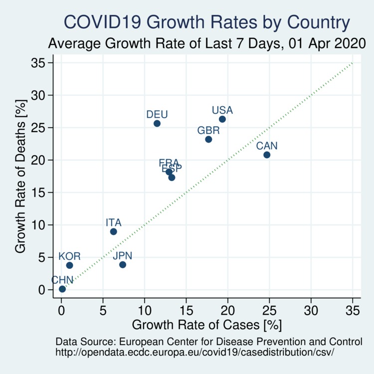
click on image for high-resolution PDF version
The above chart shows that the curve has flattened considerably not only in China and South Korea, but also Italy. Canada's growth rate is still alarmingly high for new cases, although lower for fatalities.
What matters most is the immense human cost inflicted on our societies by the COVID-19 virus, the death toll. The next scatter plot shows the fatality rate (per million people) on the vertical axis and the unadjusted raw fatalities-per-diagnosis rate. The latter is heavily influenced by the degree of testing. The fatalities-per-diagnosis rate is high in Italy probably due to a lack of testing capacity. Many people who are infected do not get tested, either because of a lack of testing capacity or because different countries have different standards for who gets tested when. Many infected people are not counteed, and the active case count is very likely grossly underreporting the true extent of the spread of the virus. This underreporting inflates the raw fatality rate. However, it is the vertical scale that matters: the fatality risk. The logarithmic scale shows that the differences are huge. Canada's risk remains at the lower end (as of April 1), but the growth rate is still large. Sadly, most dots on this chart will still be moving up significantly in the days and weeks to come.
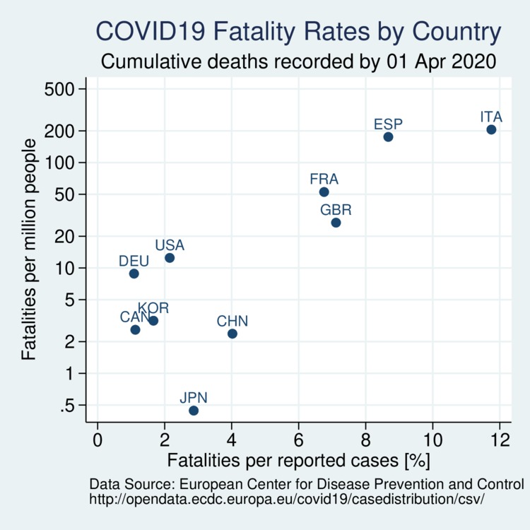
click on image for high-resolution PDF version
Again I would like to caution against drawing premature conclusions from diagrams. There are no substitute for rigorous empirical analysis. Early results are already appearing, such as Hellewell et al. (2020) in The Lancet. There are some questions that require further study: should the non-symptomatic public wear face masks? There are reports over a cultures clash over wearing masks amid virus (Globe and Mail, March 29). already. Commentary by Feng et al. (2020 in the The Lancet (March 20, 2020) discusses the current WHO policy and possible modifications among the need to prioritize available supply for health care workers. A number of academic economists have been making the case for universal cloth mask adoption (i.e., home-made masks) based on the growing evidence that there is transmission by infected people who are asymptomatic or pre-symptomatic. They argue that the estimated social benefits outweigh the small private cost significantly.
Many questions will remain unanswered for a while until we have better data. Simple country comparisons, howeer, never amount to a rigorous analysis. There are many overlapping policies that all contribute to country-level differences. To determine if particular policies or measures are effective, one either needs a controlled experiment (with separate control and treatment groups) or suitable empirical identification strategies (e.g., difference-in-difference). In the absence of rigorous empirical work, nobody should draw premature conclusions simply from comparing trends in any of the above diagrams.
A brand-new research paper Estimating the number of infections and the impact of non-pharmaceutical interventions on COVID-19 in 11 European countries from a group of authors at Imperial College sheds some light on the problem mentioned above: what is the true number of infections? Essentially, they back-calculate infections from observed deaths. For example, for Spain they estimate that 15% of the population (or 7 million people) have been infected to date, whereas Germany's attack rate is only 0.7%. See the article Covid-19 may be far more prevalent than previously thought in The Economist (April 1, 2020).
More charts, also for comparing Canadian provinces, can be found on my features page COVID-19 Country & Canadian Province Comparisons. The charts on this page are linked to the updates and therefore will also refresh every day.
Recent Blog Entries
- Should data centres provide demand flexibility to protect BC's electricity grid? (June 8)
- Wind power is growing in British Columbia (June 5)
- Canada needs better rail, but not high-speed rail (June 2)
- How are Canada's electric vehicle imports trending? (May 9)
- The 2026 oil shock may become larger than you think (April 30)
- Improving road safety and saving lives with Leading Pedestrian Intervals (April 2)
- Where are BC's LNG exports sailing to? (March 27)
- Driving electric has become much more beneficial (March 17)
- Today's ruling by the U.S. Supreme Court won't end Trump's trade wars (February 20)
- America's Federal Reserve must stay independent (January 13)
- What good are stablecoins? (19 Dec 25)
- Canada's alcohol imports have shifted (27 Nov 25)
Topics
Months
Subscribe to RSS feed ![]()