Canada's emissions from transportation have been relatively stagnant during the 2010s, hovering around 160 million tonnes per year. Emissions dropped significantly during the pandemic but have somewhat bounced back, with apparently a small permanent effect due to increased remote work and changes in commuting patterns. The chart below shows the stagnation in overall progress decarbonizing the transportation sectors. Our carbon policies that are aimed at reducing carbon emissions from transportation, it appears, have not been sufficiently effective.
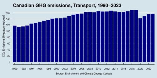
click on image for high-resolution PDF version
To understand the challenge of decarbonizing transportation, it is very helpful to disaggregate these emissions into components. Enter the transportation emission equation. Emission \(E_t\) in time period \(t\) are ultimately linked to the size of the population \(N_t\) that demands transportation services. To satisfy the demand for transportation, people buy motor vehicles, and the ratio \(V_t/N_t\) captures the per-capita demand for motor vehicles. A share of motor vehicles are gasoline-powered vehicles \(G_t\), an this share can change as more motor vehicles become electric and fewer gasoline-powered. Each gasoline-powered vehicle is driven an annual mileage to satisfy the demand for mobility, captured by \(M_t\). Vehicles have a fuel economy captured by \(F_t/M_t\) in liters per kilometer. In turn, each liter of fuel has a specific carbon intensity \(E_t/F_t\). So we arrive oat the transportation emission equation: \[ E_t = \underbrace{\left(\frac{E_t}{F_t}\right)}_{e_t}\cdot \underbrace{\left(\frac{F_t}{M_t}\right)}_{f_t}\cdot \underbrace{\left(\frac{M_t}{G_t}\right)}_{m_t}\cdot \underbrace{\left(\frac{G_t}{V_t}\right)}_{g_t}\cdot \underbrace{\left(\frac{V_t}{N_t}\right)}_{v_t}\cdot N_t\] If we further define the per-capita emission intensity as \(n_t\equiv E_t/N_t\), then we can also write down a transportation emission intensity equation by rearranging: \[ n_t = e_t \cdot f_t \cdot m_t \cdot g_t \cdot v_t \] The left-hand side of this equation, per-capita emissions from transportation, have been falling in Canada only gradually. The black line captures Canada overall, and the colored lines capture the four largest provinces. Unsurprisingly, Alberta has the highest per-capita transportation emissions.
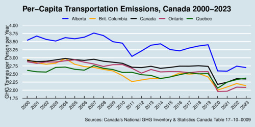
click on image for high-resolution PDF version
You may ask why we care about the decomposition expressed in the transportation emission equation. The answer is: it help us understand the different policies that can be deployed to change overall transportation emissions. There are indeed six such policy areas. The first and least interesting is the size of the population. Fewer of us burn less fuel, but population growth is largely outside policy influence. The next variable is \(v_t\) is per-capita vehicle demand. As the next chart shows, vehicle demand has indeed been rising in most places until the pandemic hit. Policies affecting this margin are focused on encouraging the use of alternative transportation modes, such as public transit and bicycles. Apparently, we are not doing a good-enough job at that in Canada.
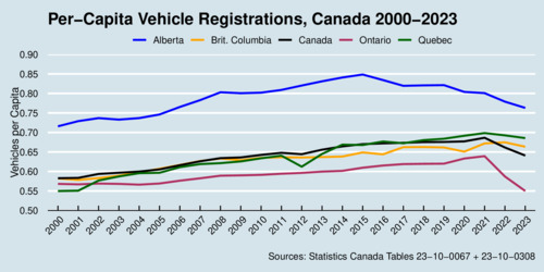
click on image for high-resolution PDF version
You may wonder about he kink in the line for Ontario in the chart above for the years 2022 and 2023, as per-capita vehicle ownership dropped by -8.1% and -6.3%. Vehicle demand was dropping noticeably (-6.3% and -3.4%), especially in 2022, perhaps because of the after-effects of the pandemic. Ontario also saw an unusual increase in its population size, which I attribute to unusually high rates of immigration during this period (+2.0% and +3.2%).
The third policy area is about changing \(g_t\), the share of gasoline-powered vehicles. Here policies are focuses on shifting people from conventional cars to electric cars. Think EV subsidies, and the zero-emission vehicle (ZEV) mandate.
The fourth policy area is about changing \(m_t\), how much we drive individual cars. Here policies are mostly working through the cost of driving. A higher gasoline price dampens demand for driving, and of course it can also affect other choices that could reduce \(g_t\) and \(v_t\).
The fifth policy area is the fuel efficiency of motor vehicles, \(f_t\). This has been tackled through Canada's equivalent of the U.S. Corporate Average Fuel Economy (CAFE) standard. Canada's policy has been aligned with the United States since 2011, but different US governments have rather different perspectives on improving fuel economy. I do not have a chart for this at this time, but tracking fuel economy across model years of cars shows improving technology. Unfortunately this progress is partially offset by the appearance of larger and heavier vehicles on our roads. Technological improvements are held back by consumer preferences.
The sixth policy area is the carbon intensity of motor fuels, \(e_t\). If a liter of gasoline contains 10% ethanol, then the overall emission intensity decreases. Biofuel mandates are the instrument of choice in this policy domain.
Below is a chart of the emission intensity per motor vehicle, which is trending downwards. It suggests, misleadingly, that there is progress. It is the wrong intensity measure to look at. We may simply be driving more vehicles, and fewer kilometers per vehicle. I show this chart as a cautionary tale. You can often find some metric that shows improvement, but it may the wrong metric to see the big picture. As shown above, the one we need to focus on is simply per-capita emissions—and there progress is painfully slow.
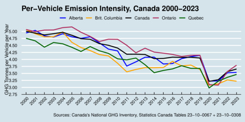
click on image for high-resolution PDF version
I have shown above that there are six distinct policy areas that can be targeted for interventions. With consumer-side carbon pricing gone as of April 2025, don't expect any action in the \(m_t\) domain. I am also not optimistic that \(f_t\) will move much in coming years. Our best hope for meaningful climate action lies in the three policy areas for \(e_t\), \(g_t\) and \(v_t\): lowering carbon emissions of fuels through a biofuels mandate, incentivizing adoption of electric vehicles, and providing better public transit infrastructure. It is encouraging to see that policy makers have indeed embraced these policy areas provincially (in British Columbia) and federally. Governments will need to stay the course even in the presence of anti-climate-action headwinds. If we care about the future of our biosphere on this planet, we need stronger climate action, not weaker climate action. And we need to understand where public policy can be most effective, and where not. Perhaps my transportation emission equation can help you understand where policy interventions are feasible, and where they can be effective.
Recent Blog Entries
- Should data centres provide demand flexibility to protect BC's electricity grid? (June 8)
- Wind power is growing in British Columbia (June 5)
- Canada needs better rail, but not high-speed rail (June 2)
- How are Canada's electric vehicle imports trending? (May 9)
- The 2026 oil shock may become larger than you think (April 30)
- Improving road safety and saving lives with Leading Pedestrian Intervals (April 2)
- Where are BC's LNG exports sailing to? (March 27)
- Driving electric has become much more beneficial (March 17)
- Today's ruling by the U.S. Supreme Court won't end Trump's trade wars (February 20)
- America's Federal Reserve must stay independent (January 13)
- What good are stablecoins? (19 Dec 25)
- Canada's alcohol imports have shifted (27 Nov 25)
Topics
Months
Subscribe to RSS feed ![]()